Topic: General Chatter
Firstly, sorry for the lack of posts lately. Things have been pretty hectic.
There has been a lot of talk lately on the locksmith forums that I read regarding the look and feel of business websites.
Generally locksmiths spend a load of money on a professionally built website with all the flashy buttons and Wordpress themes, however it appears that these sites are failing to convert viewers to callers very well due to the fact they are very similar in design to websites ued by larger national locksmith comapnies.
A lot of locksmiths have been emailing me for advice (since I do a bit of SEO for quite a few locksmiths now) and have been asking for ideas on how to make their websites look more friendly and less corporate.
I have always stood by the no frills approach, keeping it simply to the point with all relevant information highlighted accordingly.
As a working locksmith myself i know that 75% of my new leads are now via mobile search. So all the information your customer needs should be within that top half page of your index page.
Here are some MUST haves for your landing page:
- A bold clickable phone number, this is what your mobile user is looking for, if it is not clear and clickable they may not care to search your page for it and look elsewhere. Listing multiple redirect landlines is a definite no!
-A profile picture of you and possibly your van. So many sites using the pretty lady with headset on or a polished 'engineer' with a bag of new tools. This reaks of national call center or expensive large locksmith firm, and a good proportion of potential customers will steer clear.
-Publish your name and real address. Being on first name terms with your tradesman installs a massive amount of confidence. Most of my customers now call and ask for me by name and when I answer reassures them they have made the right choice.
Updated: Tuesday, 13 April 2021 10:22 AM BST
Post Comment | Permalink | Share This Post







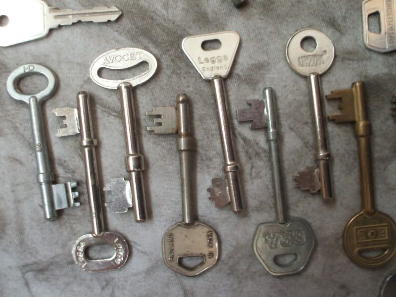
 Non payers are another rogue that you need to be aware of. I find working as a locksmith the usual suspects that regularly give me grief are small time estate agents and letting firms that like to play middleman. However if they ar struggling to get their customer to pay they usually withold your payment too. Anyone that fails to pay regularly should be refused in the future as are more of a liability than a worthwhile customer. You can take as look at my

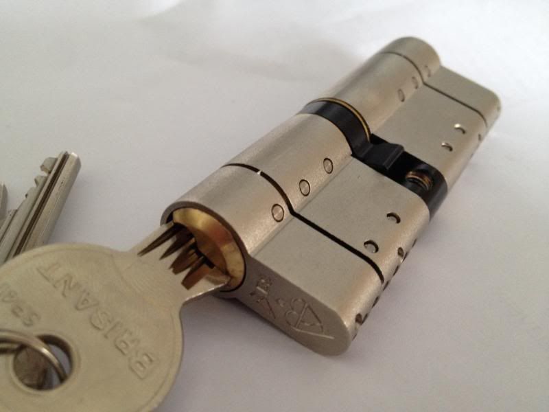
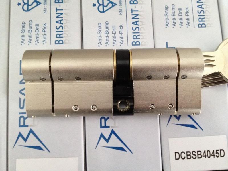

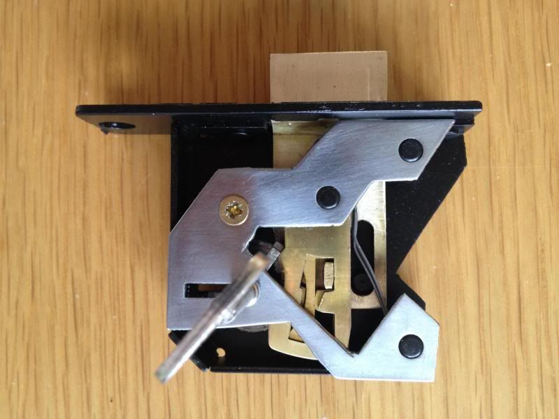

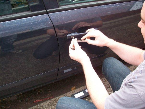 Since building theFacebook page and listing in review directories on James' behalf I have seen a wave of positive feedback from his customers who regularly email and review JS Locksmiths vouching for the excellent service provided in the Manchester area, most notably in his auto work, an area in which JS Locksmiths specialise.